It usually takes about 3 seconds before someone scrolls past your media online. If your online poster design does not grab attention immediately, nobody will read your message.
Most online posters fail because people treat them like print flyers. But online poster design requires a completely different mindset. You need visuals that pop on tiny screens and text that reads in a flash.
In this guide, I will show you exactly how to build posters that stop the scroll and keep people looking. I will break down every step from sizing to color choices to typography so you can learn the specific techniques that work.
Online Poster Design: Tips on How to Get It Right
If you want to reduce high bounce rates on your website, social media feeds or email marketing campaigns, try these online poster design tips.
1. Start with the Platform Dimensions First
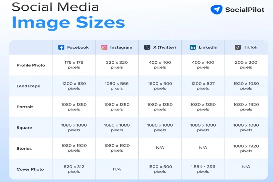
Every social platform uses different image sizes. You cannot make one poster and post it everywhere, as that leads to unnecessary cropping or awkward white bars. Check the recommended dimensions for your target platform before you open any design tool.
Based on recent information, here are the recommended online poster design dimensions for different platforms:
- Instagram: 1080×1080 pixels
- Instagram Stories: 1080×1920 pixels
- Facebook: 1200×630 pixels
- LinkedIn: 1200×630 pixels
- Pinterest: 1000×1500 pixels
- Twitter: 1600×900 pixels
While the sizes above aren’t fixed, it helps to build separate variations of your designs for each platform. Save each version with the platform name in the file to avoid grabbing the wrong one.
2. Design for Small Screens
Most people view your online poster design on a phone held two feet from their face. That means small details vanish and tiny text becomes unreadable.
To solve this, you can use an online poster maker and create customized size posters for your different types of devices. These tools can automatically design engines and creative posters promptly.
You don’t need that decorative swirl in the corner or the extra logo. Your poster has one job: stop the reader from brushing past it.
You have to just put the right prompt to these tools. Adobe AI poster maker is the best option to use.
Make sure, you have to test these posters before launching your marketing campaigns to double cross verify.
3. Pick One Clear Message Per Poster
A poster with multiple messages does more harm than good because it says nothing. You need to choose one idea or offer, then put it at the front so it’s clearly visible.
Write your message in ten words or fewer, then cut five more words. For example, “Join our free webinar about marketing next Tuesday” could become “Free Marketing Webinar. Tuesday.” Save the details for the caption or the landing page.
Your poster needs to grab attention and your caption delivers the rest of the message. Never confuse the two roles.
4. Build a Visual Hierarchy
Your viewer’s eye needs a clear path to follow. Make the largest element your main visual or headline, then move to the secondary element, which could be a subheadline or a call to action. Finally, place your smallest element, maybe your logo or date.
Here’s an illustration of how visual hierarchy works.
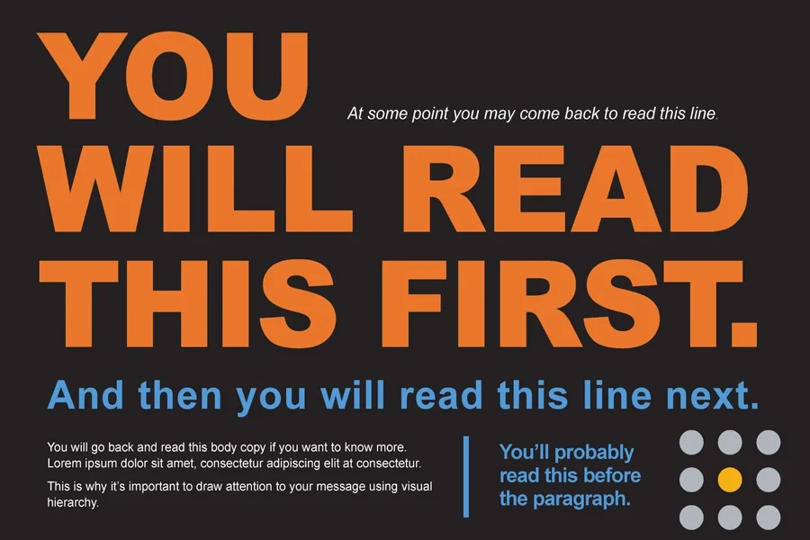
Never scatter elements randomly across the poster. Instead, place them in a straight line either vertically or horizontally. This is because a zigzag layout confuses the eye and loses your viewer.
5. Choose High Contrast Colors
Low contrast will destroy the visibility of your online poster design faster than any other mistake. For instance, light gray text on a white background disappears while red text on a blue background vibrates and hurts the eyes.
Fortunately, you don’t need to be a design expert to get this right. You can use a free online contrast checker tool like WebAIM. Simply enter your background colors and your text to get the recommended contrast ratio.
The best combinations are dark text on a light background or white text on a dark background.
6. Use Sans Serif Fonts for Readability
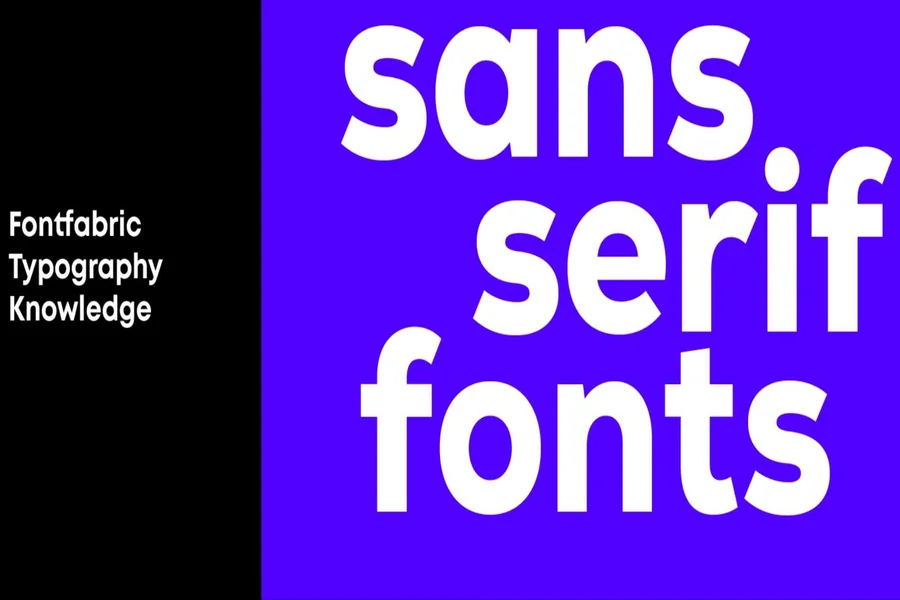
Serif fonts work fine for print because they have clean lines and can be read at any size. For the best result, choose and stick to one or two Serif font families at most. You can then use different weights like bold and regular for variations.
For example, you could use bold Helvetica for your headline and regular Helvetica for your subheadline.
Furthermore, never use script or handwriting fonts for important text. They look pretty but destroy readability and are only ideal for decorative accents only. If you cannot read a word in half a second, your font choice fails.
7. Add White Space Around Element
White space is not wasted space: it provides breathing room for your design. Elements that get crammed together feel cheap and desperate to sell something.
You need to space them out well for a professional look. Elements with generous spacing feel confident and premium.
For the best layout, leave at least 20 percent of your poster as empty space. That means no text, no graphics, no logos. Just background color or a subtle texture.
You should also check your margins and ensure nothing touches the edge of the poster. Keep a border of at least 40 pixels on all sides to prevent important elements from getting cut off by platform cropping tools.
8. Optimize Images for Fast Loading and Sharpness
A blurry image ruins your credibility instantly especially if you are setting up an important landing page. So always start with high-resolution source images. Download from stock sites like Unsplash or Pexels rather than grabbing a random image from Google search.
Resize your image to match your platform dimensions before you add text. Scaling a large image down is fine, but scaling a small image up creates pixelation and blur.
Finally, export your final poster as a PNG for the best quality. Use JPG only if file size becomes a problem. For faster loading, keep images below 1MB.
9. Include One Clear Action Without Clutter
Your poster needs a next step, but that step should not overwhelm the design. Use single verb phrases like “Sign up.” “Watch now.” “Download.” “Register.”
You also need to get the placement right, and usually, the bottom of the poster works very well. Keep the action text short and punchy and use a button shape or a simple underline to make it stand out.
Do not include a URL directly on the poster. URLs look ugly, and nobody types them from a phone. Put the link in your caption or use a link in bio approach. Your job is to get the click, not to display the web address.
Conclusion
Great online poster design is not magic. It is a system of rules and choices that puts your message first. You know the dimensions. You understand contrast and spacing. You have a template and a testing method.
Now you just need to practice. Open your design tool today and build one poster using these steps.